*Part 2 of the Indeex series — Improving Production Lines, Step by Step*
Last month we looked at why downtime data in most plants is unreliable, and how a consistent classification structure is the first step toward measurable improvement. If you missed it, the April article on downtime classification is the foundation for everything that follows.Type your paragraph here
This month, we move from cleaning the data to using it. Once downtime is captured consistently, the next question is unavoidable: where do we start?
The honest answer in most plants is "everywhere at once." Improvement meetings list ten problems, three teams take on different priorities, and four months later the OEE chart looks the same. The issue is rarely effort. The issue is focus.
Why This Is the Next Step
There is a well-known principle in operations that says a small number of causes are responsible for the majority of losses. The economist Vilfredo Pareto observed it in wealth distribution in 1906. Forty years later, the quality engineer Joseph Juran applied the same observation to manufacturing and coined the phrase that still defines it today: the vital few and the useful many.
In a production line, the same rule holds with remarkable consistency. Roughly twenty percent of downtime causes typically generate eighty percent of the total time lost. The exact ratio varies — sometimes it is 70/30, sometimes 90/10 — but the pattern is reliable enough to plan around.
This matters because the alternative is exhausting. A plant that tries to fix every problem treats a five-minute jam with the same attention as a forty-minute changeover overrun. The team spreads itself thin, progress is slow, and motivation fades. A plant that identifies the top three or four causes and concentrates effort there usually sees results within a quarter.
The Pareto view is not a tool for narrowing your ambition. It is a tool for sequencing it.

What Typically Goes Wrong
There are three common reasons plants fail to act on Pareto thinking, even when they intuitively agree with it.
The Pareto is misleading because the data is wrong. This is the most frequent issue, and it is exactly what April's article addressed. If twenty percent of your downtime is filed under "other," your Pareto chart is showing you the symptom of poor classification, not the real losses. The fix is upstream — clean the categories first, then trust the chart.

The Pareto is correct but ignored. Some plants produce a perfectly accurate Pareto and still chase the most recent or most visible issue instead. A loud breakdown gets attention even if it is not in the top five. A small recurring jam that costs more cumulative time gets overlooked because no single event feels urgent. Focus discipline matters more than analytical accuracy.
The Pareto is treated as static. A Pareto chart from January will not reflect the line in May. Top losses shift as the obvious ones are resolved, products change, and seasons affect demand patterns. A plant that draws a Pareto once a year is using a photograph to navigate a moving line. The chart should refresh continuously.
What Good Looks Like
A useful Pareto in a production environment has three characteristics.
1) It is built from complete data, not just the events the operators remembered to log. This means short stops, micro-interruptions, and speed losses are captured automatically, not entered by hand at the end of a shift.
2) It is segmented in ways that match how the plant actually operates. A single Pareto for the whole line tells you less than separate views by shift, by product family, by machine, and by week. The same overall top three may have very different sub-causes depending on the cut. A morning-shift Pareto often looks nothing like a night-shift one - and that difference is where the improvement lever sits.
3) It is connected to action, not filed in a report. Each item in the top three should have a named owner, a defined improvement approach, and a measurable target. The Pareto is the input to the weekly operations review, not its conclusion.

From Data to Action
The practical sequence we recommend to plants starting Pareto-driven improvement is simple, and it sits naturally on top of the downtime classification work from April:
First, generate the Pareto from at least four weeks of clean data. One week is too short to filter out random events.
Second, look at the top five causes and ask one question for each: is this an event we know how to fix, or do we need to investigate the root cause? The first category goes to standard problem-solving. The second goes to a focused analysis effort
Third, commit to the top three for at least one improvement cycle — typically a month or a quarter. Do not add new initiatives until the first three show measurable progress or are formally closed.
Fourth, refresh the Pareto at the end of the cycle. The top three will change. That is the point.
McKinsey's lean operations research describes this discipline directly: leading plants link OEE data on individual lines to financial performance so they can prioritize the implementation of countermeasures rather than treat every loss as equally urgent. The Pareto is the simplest version of that prioritization logic, and it works at every scale of operation.
Where Indeex Fits
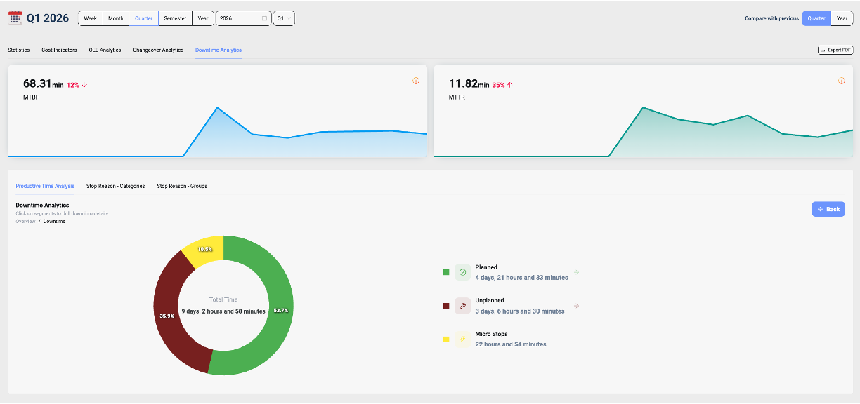
Indeex is built around exactly this loop. The platform captures every stop directly from the line, including the short interruptions that manual systems miss, and applies the consistent classification that the April article described. From that clean dataset, Indeex generates a Pareto view that is live — by line, by shift, by SKU, by machine, by week — and refreshes automatically as new data arrives.
The result is that the plant team does not need to build the analysis. The top losses are visible on the screen, segmented in the cuts that matter, and updated continuously. When the top three change because the previous ones were resolved, the chart reflects it without anyone rebuilding a spreadsheet.
This turns the Pareto from a quarterly exercise into a daily operating reference. The morning shift handover can start with the current top three. The weekly improvement meeting can review them with confidence. The monthly KPI review can show what was resolved and what replaced it.

What You Can Expect
Plants that move from broad improvement effort to disciplined Pareto focus usually see two changes within the first quarter.
The number of active improvement initiatives goes down. This sounds like a step backward, but it is not. Three initiatives that close successfully produce more output than ten that drag for a year.
The pace of measurable improvement goes up. When effort concentrates on the largest causes, the resulting gains are visible in the next month's OEE chart, not three quarters later. This builds the credibility the continuous improvement program needs to sustain itself.
The shift is from activity to outcomes, and the data is what makes it possible.
Closing
Most plants already have the instinct that some losses matter more than others. What they lack is the visibility to know which ones, refreshed often enough to be useful, segmented in the ways the line actually operates.
April was about making the data trustworthy. May is about using it to focus. The next step in the series, in June, will look at the layer of losses that even a good Pareto can miss — the microstops and short interruptions that disappear in manual reporting and quietly absorb capacity.
Next Step
If your plant tracks downtime but the improvement program still feels scattered, the issue is usually not effort. It is focus.
We can walk you through how a real production line surfaces its top losses automatically, segments them in the cuts that matter, and turns them into a structured improvement routine — without adding work to the plant team.
Book a short demo here:
References
1. Juran Institute, *A Guide to the Pareto Principle (80/20 Rule) & Pareto Analysis* — [juran.com](https://www.juran.com/blog/a-guide-to-the-pareto-principle-80-20-rule-pareto-analysis/)
2. McKinsey & Company, *Extended Lean Toolkit for Total Productivity* — [mckinsey.com](https://www.mckinsey.com/capabilities/operations/our-insights/extended-lean-toolkit-for-total-productivity)
